About Project
Dr. Chicarolli
Website for a performance medicine clinic — weight management, hormone therapy and high performance. The job was not to inform, it was to turn a visit into a booked appointment. Live at drchicarolli.com.br.
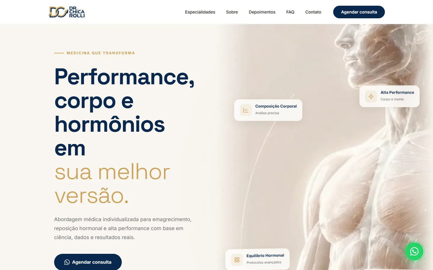
Editorial hero with the booking CTA always in view.
Role: visual direction, UX and front-end implementation.
- A clinical visual system without losing warmth and appeal;
- A journey built around one action: booking an appointment;
- Social proof and content organized around patient objections;
- Responsive interface integrated with WhatsApp.
The challenge
Performance medicine competes with a noisy market of quick promises. The site had to sound clinical and trustworthy — without losing the aesthetic appeal the audience expects — and resolve the tension between medical authority and aesthetic desire on the same screen.
The central decision was tone: a deep navy and gold palette on cream, heavy type in the headline and generous breathing room. Serious enough for credibility, warm enough not to feel like a hospital.
Decisions
-
01
One action, repeated
“Book an appointment” appears in the sticky header, in the hero and at the end of every section — always the same label, always the same destination. Consistent repetition converts better than a variety of CTAs.
-
02
Type contrast as hierarchy
The headline uses two weights and two colours in one sentence — the problem in heavy type, the promise in light gold. The hierarchy reads at a glance, before you read a word.
-
03
Structured social proof
Specialities, testimonials and FAQ in the order the doubt shows up: what you treat, whether it worked for someone like me, and the objections that block booking. The FAQ is conversion, not support.
-
04
Cards floating over the image
“Body composition”, “High performance”, “Hormone balance” sit as cards layered over the hero image. They communicate the breadth of the service without needing a whole section — and give the composition movement.